Component Documentation Generator
No one had time to maintain our design system docs. I built a Figma plugin that generates complete documentation in under a minute.
TL;DR
Impact: Reduced documentation time from 30-45 minutes to under a minute per component, with timing depending on component complexity (480+ variants). Documentation stays current automatically. New designers onboard from accurate specs instead of outdated PDFs. Developers reference current documentation when implementing components, cutting integration back-and-forth.
Problem: Design system docs at ConnexAI were always outdated. No one had time to maintain them. The work was manual, boring, and constantly deferred.
Solution: I built a Figma plugin using Claude API that extracts component data, generates contextual explanations, and embeds live instances so docs regenerate faster than they can drift out of sync.
Process: Shipped in under 24 hours using Claude Code for implementation, Cursor for quick fixes, Claude chat for debugging, and v0 for UI iteration. AI tools aren't interchangeable. Knowing when to switch between them is what made this possible.
Role & Responsibilities
- Solo Developer & Designer
- Plugin architecture
- Claude API integration
- TypeScript development
- Testing & validation
This was a personal project I built to solve a documentation pain point I experienced firsthand while working on ConnexAI's design system.
Project Goal
Eliminate the manual documentation bottleneck by making documentation a by-product of the design process, not a separate task done afterward.
Context
My team lead flagged a recurring problem: most of our component documentation was outdated or incomplete. No one had time to maintain it. The work was manual, time-consuming, and frankly boring. It was the kind of task everyone agreed was important but no one wanted to do.
Since I'm known as the AI advocate on the team, I was asked to find a solution. But I had constraints. My company doesn't allow AI tools connecting directly to our design system or codebase. We're protective of our source files. So I started by researching existing Figma plugins and FigmaMake workflows, looking for something that could automate documentation without exposing our design system externally.
None of them fit. The plugins I found generated documentation in formats that didn't match how our team structured specs. They were generic solutions for a problem that required understanding our specific documentation patterns. So I built one myself.
The documentation wasn't a tool designers trusted. It was a liability they maintained.
The problem: documentation as an afterthought
The manual workflow had four compounding issues. It was slow. 30-45 minutes meant documentation was always behind, always deferred. It was error-prone. Raw property strings like "variant=Body 2 • 14 sp, Weight=Normal" were hard to parse and easy to copy incorrectly. And it was cognitively dense, presenting data dumps with no explanation of why variants existed or when to use them.
Most critically, it was non-visual. Documentation lived in separate files while the components lived in Figma. Designers had to switch between two contexts to answer a simple question. That friction meant most designers stopped consulting the docs at all.
The outcome: documentation fell out of sync, onboarding took longer, design consistency eroded, and maintenance became expensive. The system was designed to help designers, but it was creating work.
What I Built
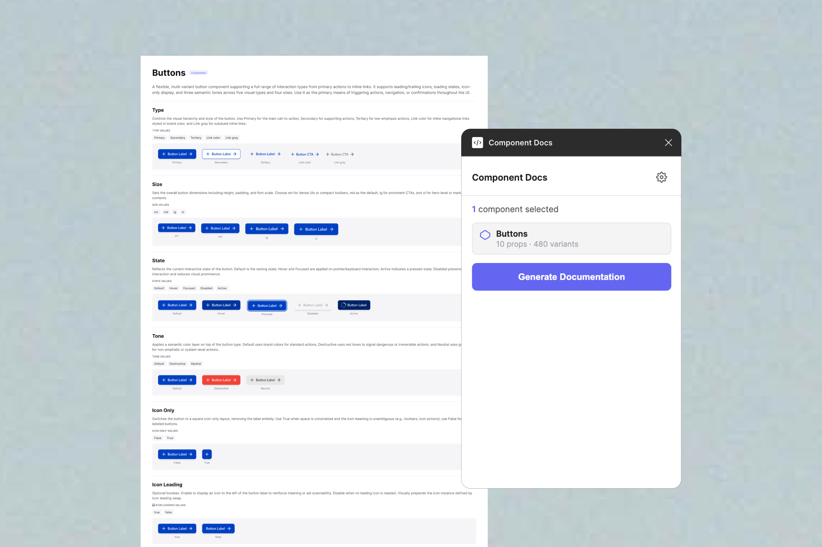
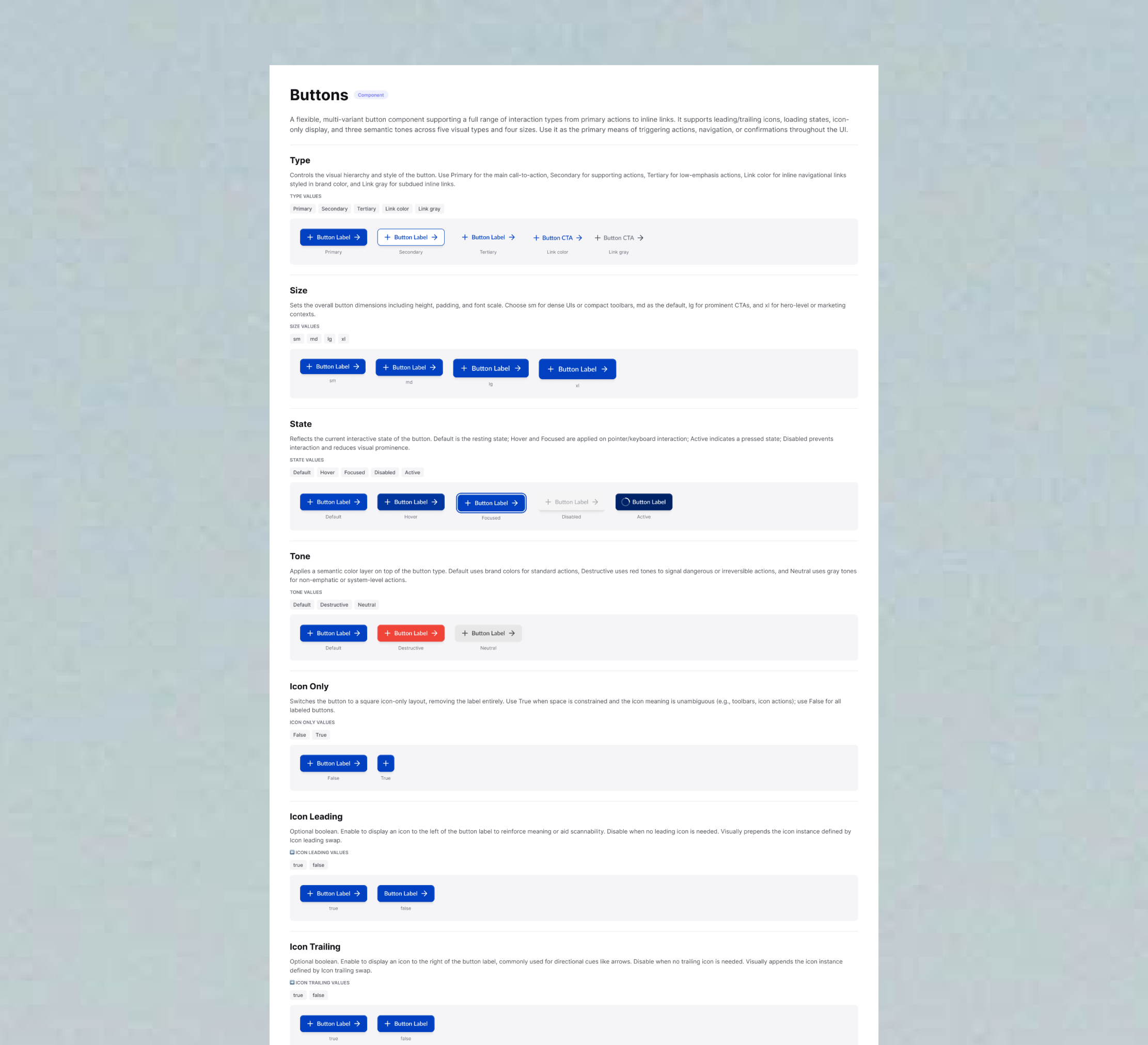
A Figma plugin that generates complete visual documentation in under a minute. Select a component, click Generate Documentation, and the plugin creates a fully formatted documentation frame adjacent to the component on the canvas. Generation time varies based on component complexity.
The plugin extracts component properties, variants, nested elements, typography specs, and spacing values automatically. It sends that data to Claude API with a structured prompt. Claude generates contextual explanations, not just "size: 24x24" but something like "Use this variant when icon clarity takes priority over label length." The plugin then builds documentation frames on the canvas with embedded live component instances, anatomy tables, and spacing annotations.
Because the docs embed live instances rather than screenshots, they stay in sync. When a component changes, you regenerate. The docs reflect the current component, not a snapshot from six months ago.
The plugin generates a first draft, not a final artifact. Designers review and edit descriptions before committing them to their documentation. This keeps human judgment in the loop while removing the blank-page problem that made documentation feel like a chore.
Design Decisions
Why Claude API instead of templates
I considered using simple templates or storing descriptions in component metadata. But component variant matrices are information-dense in ways templates can't handle. Templates can describe structure, but they can't explain intent. Claude reads the entire component and generates contextual prose. Designers get explanations instead of property dumps.
Trade-off: Requires an API key, adds 2-3 seconds of latency, and costs a small amount per component. Worth it for documentation that reads like it was written by someone who understands the component.
Why embed live component instances
I could have used screenshots. Live instances are better. Designers can click through to the actual component. Spacing is visible as real dimensions. Most importantly: when the component updates, the documentation updates automatically on next generation. Screenshots go stale. Instances don't.
Trade-off: More complex implementation. The component must be in the same file. Instance positioning took several iterations to get right. But documentation stops being a separate artifact and becomes tied directly to the source.
Why tables, and why padding only
Design system specs involve many elements across many properties. Text blocks are hard to scan. Visual cards get cluttered fast. Tables let designers go directly to what they need, like "What's the icon size in Button Small?" without reading through a paragraph.
I initially annotated both padding and internal gaps. Testing with real components showed gap annotations created visual noise without adding clarity. Padding is what designers reach for. Internal gaps can be inferred from the component's structure if needed. Removing gap annotations made the spacing section immediately more readable.
Why AI output is always editable
Claude doesn't always get descriptions right. Complex multi-variant components sometimes produce generic explanations, and edge cases can confuse the model. I considered adding confidence indicators or flagging when descriptions seemed weak, but for v1 I kept it simple: all generated text is editable, and designers are expected to review before using.
The plugin treats AI output as a starting point, not a final answer. Designers bring context Claude can't access: why a component was designed a certain way, what edge cases matter for the team, which variants are deprecated. The plugin handles tedious extraction and formatting. Designers handle the judgment.
What broke and what I learned
The hardest part wasn't the AI integration. It was the Figma API behaviour. After removing fixed heights on text elements, they collapsed to 1px. Text overlapped, layouts broke. The fix was applying auto-layout with "hug content" to all text containers. A setting that isn't obvious until you've spent time debugging invisible text.
The plugin also crashed consistently with a getNodeById error. Figma's permission model requires different API calls depending on manifest settings. With dynamic page access enabled, you must use async-only APIs. Replacing synchronous calls with getNodeByIdAsync throughout fixed it, but that kind of thing isn't in the main documentation.
Component instances failing to embed was the trickiest issue. The problem wasn't instance creation, but that parent frames needed auto-layout enabled before instances were added, properties had to be applied in the right sequence, and positioning logic had to account for frame padding. Each of these was discovered through testing, not documentation.
Every polish fix was found through testing against real components, not by anticipating edge cases in theory. The gap between "works in a test file" and "works reliably across a production design system" was bigger than I expected.
AI-Assisted Development Workflow
I used multiple AI tools throughout development, each for a different purpose. Claude chat handled research and ideation, helping me explore Figma Plugin API patterns and understand how to integrate Claude API for description generation. ChatGPT filled gaps for Figma's publishing process and plugin architecture requirements.
For implementation, I worked in Claude Code (running inside Cursor) to write TypeScript, set up the plugin structure, and build the core data extraction logic. When I hit simple errors like syntax issues or import statements, I switched to Cursor for quick fixes that didn't need Claude Code's deeper context.
Debugging complex issues required different tools. The getNodeById async error and 1px text height bug both needed research before solutions. I went back to Claude chat to understand root causes, research Figma's permission model, and explore why dynamic page access requires async APIs and why auto-layout needs "hug content" sizing mode.
For UI prototyping, I used v0 to iterate on the plugin's layout before implementing it in actual plugin code. Separating visual design from technical implementation let me move faster on both.
Switching between tools based on what each does best helped me ship a working plugin in under 24 hours. The lesson: AI tools aren't interchangeable. Knowing when to switch is what makes them useful.
Outcomes
Tested against ConnexAI's live component library with Button, Alert, and Input. Each generated complete documentation with anatomy tables, typography specs, spacing annotations, and contextual descriptions. Manual documentation for all three would have taken 90-135 minutes. The plugin did it in under 2 minutes total, demonstrating significant efficiency gains even on complex component systems.
The plugin shifts documentation from a writing task to an editing task. Designers stop composing from scratch and start reviewing drafts.
Beyond the time saving, the quality difference mattered. Generated documentation explained why variants exist, not just what properties they have. Anatomy tables made component specs scannable in seconds instead of buried in text. And because docs embed live instances rather than static exports, they stopped being a maintenance burden and became faster to regenerate than to edit.
The impact extends beyond the design team. New designers onboard from current specs instead of outdated PDFs. Existing designers spend less time on maintenance. And developers reference accurate documentation when implementing components, reducing back-and-forth about intended behavior.
Built and tested as a private plugin for ConnexAI's design system. Functional and ready for deployment in any Figma-based design system.
Reflection
Building this taught me that documentation problems are usually process problems in disguise. The real issue at ConnexAI wasn't that designers were lazy about docs, it was that the workflow made documentation a separate, manual task that competed with design work. When you remove that friction, documentation happens naturally.
I also learned where AI actually adds value in tooling. Claude is genuinely useful for contextual, semantic work like writing explanations that account for intent, not just structure. It's not the right tool for simple data extraction or layout logic. The most impactful use of AI here wasn't replacing work, it was generating the kind of explanation that no template could produce, one that understands why a component was designed the way it was.
If I were to extend the plugin, I'd focus on token documentation next. The same problem exists for colour, spacing, and typography tokens. I'd also explore conditional section visibility, letting teams toggle which documentation sections appear based on their team's needs.